Friday 30 March 2007

Final Post: Learning Outcomes

1. Explain and discuss practical and theoretical aspects of Human-Computer Interaction.

Group Dynamics
Using Personas
Method of Documenting Tasks
Discussion of Colour Use
Discussion of Paper Prototyping
Explanation and Application of Heuristics


2. Apply HCI Principles to Practical Problems

Personas
Persona 1 Persona 2 Persona 3

Questionnaires
Final Questionnaire Design

Prototyping
Individual Prototypes: 1 2 3 4
Initial Prototype: Hardware Navigation Features
Final Prototype: Hardware Features Navigation

Task Analysis and Scenarios
Initial task analysis 1 2 3
Task analysis of test scenarios


Mock-Ups
Initial prototype mock-up
Final prototype mock-up


Walkthroughs and Heuristic Evaluation
Persona walkthroughs 1 2 3
Blind walkthrough
Voice recognition walkthrough
Heuristic evaluation


3. Participate in Analysis and Design Work in HCI

Brainstorming
Initial Ideas 1 2 3 4
Brainstorm for final idea

Creating Personas
Personas 1 2 3

Defining Key Tasks and Scenarios
Initial task analysis 1 2 3
Task analysis of testing scenarios

Questionnaires
Questionnaire drafts 1 2 3
Questionnaire results

Creating Prototypes
Individual Prototypes: 1 2 3 4
Initial Prototype: Hardware Navigation Features
Final Prototype: Hardware Features Navigation

Testing and Evaluation
Initial ideas
Testing 1 2 3 4 5 6
Initial prototype evaluation
Final prototype evaluation


4. Demonstrate appreciation of the research literature in one subfield of HCI.

(Applicable to Matt only)

Alternatives to UCD


HCI Extended Report - Alternatives to User-Centred Design


This module has involved using the user-centred design process to create a product design, but there are a number of alternative methods. Some notable ones are as follows:

Waterfall Model

The waterfall model is one of the oldest design models, described by Royce in 1970 [1]. The model is simple, easy to understand and good for helping to maintain discipline in development (this is considered a weak point of user-centred design, where the practice of methods may not be consistent [5]), but it has been criticised for not being able to adapt to changing requirements [2]. The model also has very little interaction with users, who are only involved in the initial requirements phase.

Iterative Models

There are a number of development methods (e.g. spiral model [9], and Rational Unified Process [13]) that rely on the iterative model of creating intermediary prototypes that can be used to gain feedback. Traditional iterative methods are more flexible, but still have minimal contact with users (there is no design collaboration, but feedback can be given on prototypes), and there are still large amounts of documentation, which makes it more time-consuming to cope with changing requirements [14].

Agile Development

Agile development methods (e.g. “Extreme Programming” [10]) are similar to iterative models, but focus on very quick iterations that deliver working software, self-organizing teams with an emphasis on face-to-face communication (with less documentation), greater collaboration with users, and adaptability to changing requirements at any stage [11]. Agile development shares some common ground with user-centred design (e.g. iterative development and emphasis on communication with users), but the functionality is still the central focus [12]. This method may not be suitable for projects involving larger teams (face-to-face communication becomes more difficult with more people), or safety-critical projects that may require a lot of discipline and formal documentation.

Usage-Centred Design

Usage-centred design, as outlined by Constantine [3] [4], is a methodology that focuses around the tasks that have to be performed, rather than the users. The process is more formal than user-centred design, and has less user involvement, but can still provide good usability by concentrating on making tasks as easy as possible to perform. Key concepts of this method include “essential models” (models of the system with no assumptions about implementation) and “task cases” (abstract use cases where user input is split from system operations). A similar approach is “performance-centred design” [7], which incorporates many user-centred tools with a task focus. Usage-centred design appears to have many of the benefits of user-centred design, but it may not be sensitive to particular needs of specific user groups (e.g. the focus is on making tasks as efficient as possible, which may be detrimental to novice users who need more guidance).

Participatory Design

Participatory design [8] aims to involve the user as much as possible, and create a “third space” where users and designers can both learn and contribute. This is achieved using methods such as workshops (e.g. users will test a feature and then go to a workshop to discuss it with designers) and cooperative prototyping. This approach is at the extreme end of user-involvement, and appears to be very good for generating new ideas, due to the large number of outside perspectives involved. However, it may suffer the same drawbacks as user-centred design (e.g. a lack of discipline [3] and the incorporation of too many features (“Featuritis” [6]). Participatory design may be suitable for very specialised applications, where the user knowledge becomes more valuable. Principles of this approach also seem evident in websites such as Wikipedia, where the users themselves are creating the content.

Conclusion

The methods described above all try to provide a new approach to software design, but there is a large overlap in terms of the actual methods used to achieve goals, and designers could probably improve usability by simply applying compatible techniques from other methodologies into whichever one they choose. There is no clear-cut superior method, and different approaches seem to be suited to different project characteristics, but I feel that usage-centred design provides the most convincing alternative to user-centred design for improving usability in general-purpose interfaces, with a good balance of discipline and adaptability to user requirements.

References

[1] "Managing the Development of Large Software Systems" - Winston W. Royce.
[2] "Understanding the Pros and Cons of the Waterfall Model of Software Development" -TechRepublic, September 2006.
[3] "Usage-Centred Engineering for Web Applications" - Constantine and Lockwood, March 2002.
[4] "Frequently-Asked Questions about Usage-Centred Design" - Constantine and Lockwood, 2003.
[5] "A Survey of User-Centred Design Practice" - Vredenburg, Mao, Smith and Carey, 2002.
[6] "Designing Web Applications for Use" - Constantine and Lockwood, 2006.
[7] "What is Performance-Centred Design" - Craig Marion, August 1997.
[8] "Participatory Design: The Third Space in HCI" - Michael J. Muller.
[9] "A Spiral Model of Software Development and Enhancement" - Barry W. Boehm, May 1988.
[10] "Extreme Programming: A Gentle Introduction" - Don Wells, 2006.
[11] "Principles Behind the Agile Manifesto" .
[12] "User-Centred Development Process" - Hubmann.
[13] "Rational Unified Process" - IBM.
[14] "Testing Methodologies" - Microsoft, January 2005.


Thursday 29 March 2007

Evaluation

Potential Improvements/Extensions

We conducted another walkthrough and discussion of our final prototype, and came up with a number of potential improvements that could be implemented given more time:
  • Although we believe we improved the usability of the watch with the final prototype, it still requires an instruction manual to learn how to perform the functions. We decided that providing information on the watch itself would require removing the analogue look and feel. One option could be to offer digital-style versions of the watch, with a screen providing information and help (similar to "Initial Prototype 1" posted by John).
  • When we designed the menus, we limited ourselves to a small screen size and tried to make large buttons. This caused issues with trying to fit all the functionality on a page, while at the same time providing enough information for the user. One potential solution would be to include some general functionality (e.g. the "Back to Main Menu" button) on the help screen instead.
  • In the final prototype the user can reply to messages, which caused issues with how to implement error handling. If the user makes a single mistake, they cannot erase that portion, they have to clear the whole thing. In addition, if an error occurs, they have to start the message again. This highlighted the need for an "eraser"-style method of removing text on input screens, and possibly making input errors pop-up on the same page, highlighting exactly where the errors occurred.
  • The speech input functionality was not elaborated on too much, as we made the assumption that voice recognition would be accurate in the future. If we had more time, we could explore this aspect of the system in more detail.
  • The input device may appear quite daunting to some users at first (e.g. people similar to the "Derek" persona), and in some cases may not be used as much as the watch. We have tried to make the interface as simple as possible, but the amount of functionality included increases the complexity. Improvements could be made in creating a menu structure which makes the simple and necessary functions obvious (e.g. adding info, viewing info, setting contacts), and some of the less necessary functions are put in the background (e.g. changing colours, replying to messages, etc).
  • More "expert" customisation could be included (for example the ability to turn off confirmation messages to speed up tasks).
  • Some method of showing where the user actually is in the navigation (e.g. breadcrumbs) would help to reduce confusion, as sometimes it feels like pages are being handed to the user, rather than the user is traveling through them.
  • An extension out of the scope of the project aim would be to adapt the input device so that nurses who care for people at home could use it to send more detailed information directly to records.
  • One aspect not considered was that there are many opportunities to abuse the system (e.g. spamming GPs, making repeat calls to emergency services, etc). We would need to find a way to deter malicious uses of the system.
Overall Evaluation

We feel that we have managed to achieve the task of creating a useful device for elderly people. In particular, the watch part of the system could provide an invaluable service for any elderly person concerned about their health, while the input device has varying benefits depending on the health condition of the user and their willingness to use it.

Transferring our design to the real world is difficult to envision, as not only is it based on a number of assumptions about future technological advances, but it would also require the implementation of an infrastructure between users and health professionals (e.g. another piece of software would have to be designed for the GP to manage information being sent by multiple patients).

Tuesday 27 March 2007

Final Prototype - Mock-ups

Powerpoint mock-up

The final Powerpoint mock-up can be downloaded at the link below. The new mock-up contains examples of all the new additions to the interface, and gives examples for the main scenarios. As with the first mock-up, it cannot model the handwriting input or proper contextual navigation using the "go back" buttons, but still models the menu structure well.

http://rapidshare.com/files/23292430/mockup.ppt.html

Paper Mock-up

Below are some crude paper mock-ups of the device and watch, made to scale.


Monday 26 March 2007

Final Prototype - Menus and Navigation

Navigation Structure


The image above shows the navigation structure from the main menu. Vertices without arrows indicate bi-directional paths, where the user can choose to go back to the previous menu. Shaded menu boxes indicate where navigation jumps to another section. The structure now incorporates error handling and undo functionality, two areas we found lacking during testing.

Menu Design

Here are some general points about the menus, and changes that have been made:
  • Colours have been changed slightly, in terms of consistency for buttons and achieving better contrast.
  • The menus no longer rely on just colour changes for making text stand out, important text is resized or in bold.
  • Technical jargon has been reduced further, with terms such as "info", "delete", "settings"and "edit" being replaced by "information", "remove", "options", and "change".
  • Different images are now used for buttons going back a step and those which return to the main menu.
  • The user can now undo many operations, and redo them if they wish. The undo screens have verbose descriptions of what is happening, with information carried over from previous stages in the task.
  • The scroll bars have been redesigned, so that the user can just move their finger along them to move text. A fingerprint is used to try and get across how to use the bars.
  • Buttons have been spaced apart more where possible.
  • Error messages are now produced for invalid text input, to provide feedback which was non-existent in the initial prototype. The user is provided with a range of choices for recovery, explained verbosely.
  • Notification screens have been added to areas where they were missing before (e.g. changing options), along with appropriate undo functionality.
  • Due to the extra functionality of being able to send to different people, the messages menus now display who sent a message.
  • Logs are now sorted with newest entries at the top, and the user is able to delete the oldest entries to ensure the logs don't become too long.

Menu Examples

The image below contains a number of examples for the different menu types in the final prototype. The full menu system will be available in the mock-up, due soon.

Sunday 25 March 2007

Final Prototype - Features

This section defines the functionality for each device:

Watch
  • The time can be changed by winding either of the buttons, the user does not need to know which.
  • Tracks the users movement and location.
  • Monitors the users heart rate and body temperature, and can detect if the user is wearing the watch.
  • An emergency signal is automatically transmitted if the monitored information becomes suspicious (e.g. the watch is operating, but there is no pulse or movement).
  • A manual emergency signal can be activated by pushing and holding the two buttons for two seconds. The watch vibrates for three seconds and the red light is activated. During this time the user can cancel the alarm before it is activated (by pushing the two buttons). An audible alarm is sounded, and the emergency signal is transmitted.
  • The emergency services can be contacted by pushing the two buttons once. As with the alarm, the watch warns the user with a vibration and a red light, allowing them to cancel before the call is made. The call is outputted using a speaker, and the user can speak directly into the watch.
  • A family member (assigned to the watch using the input device) can also be contacted, by pressing one button and holding for two seconds.
  • All functions are turned off by pressing any button.
  • Two LED lights provide feedback to the user about the watches state, allowing them to ensure the watch is functioning, or that they have not pressed a button by mistake. For example, no light means that the watch is currently not operational (e.g. if the user is no wearing it). A green light means that the watch is operational (the user is wearing it). A red light means that one of the emergency functions is currently running.

Input Device
  • User can input general health information, which is stored in logs for each category.
  • Example categories include weight, blood pressure, heart rate, diet, and exercise log.
  • The user can make their own categories if they wish.
  • All information stored in the device is viewable and editable.
  • Information can be sent to a number of health professionals stored as contacts in the device (e.g. GP or dietician).
  • Contacts can send messages directly to the device, allowing them to provide quick advice, book appointments, etc. Users can reply to these messages if they wish.
  • Users are prevented from modifying or sending data that has already been sent.
  • Ability to change some options (e.g. colours, units used for values, contact details, etc).
  • Navigation is performed using the touch screen, with "soft" buttons displayed on pages.
  • Ability to hand-write data into the device. This assumes text recognition is more advanced in the future.
  • Ability to input commands using the microphone. This assumes speech recognition is more advanced in the future. We found that this function was better suited to "expert" users, as it provides quick shortcuts for tasks.
  • Context-sensitive instructions are displayed on the left screen of the device.
  • Text can be verbalised by clicking it (or hovering in the case of buttons). The device also provides some context about the text (e.g. it will tell the user that the text belongs to a button, and the button may belong to a certain piece of information).
  • Text can be made larger and smaller by placing two fingers on the touch screen and pulling them apart (or bringing them together).
  • The features for the input device have remained relatively unchanged from the initial prototype, with the exception of security-related features and some minor changes.

Security System

The optional security features have been removed from the prototype, to reduce the complexity for the user, and to allow us to focus on the health monitoring aspect.

Final Prototype - Introduction and Hardware

Health Monitoring System

Our final prototype is a pair of integrated devices used for monitoring an elderly person's health. The aim of this system is to help save lives through quicker response to potential problems, and to try and make it easier for someone to check their own health at home, without requiring a large number of check-ups, particularly if the person has to check their health anyway (e.g. if they have been told by their doctor to keep a record of their weight and diet). The user would be able to receive free assistance with set up and tutorials on purchasing the device.

The system consists of two pieces of hardware: a watch used for monitoring the user's heart rate and movement and a portable input device for allowing easy logging and sending of health information.

Watch

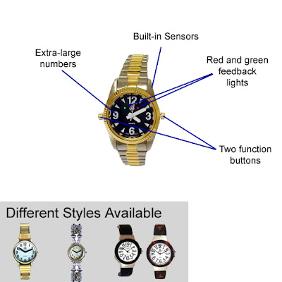
The watch is used for real-time monitoring of the user's heart rate, movement and location. It is designed to require as little input from the user as possible to function correctly.
  • The watch is digital, but has an analogue appearance.
  • Available in a variety of styles for both the watch strap and the face.
  • Available with larger numbers for easier viewing.
  • Built-in GPS tracking and wireless transmission using GPRS. This is under the assumption that GPS is more accurate in the future, and can work indoors.
  • Built-in bluetooth for communicating with the input device automatically (e.g. to store a log of heart rate averages).
  • Built-in speaker and microphone for making emergency calls.
  • Waterproof.
  • Takes regular watch batteries, replaceable without the need for a screwdriver.
  • Two buttons used for performing different actions: Either button can be used to wind the time, pressing both buttons together makes a call to emergency services, pressing and holding both buttons sends a panic alarm, and pressing and holding a single button makes an emergency call to a family member.
  • Built-in red and green LED lights to indicate different states: green if the watch is being worn and is operating, off if the watch is not operating, and red if an emergency call or alarm has been activated.
  • Built-in vibration capability to notify the user when emergency functions have been activated.
  • Built-in sensors to monitor heart rate, body temperature, movement, and detect if the watch is being worn.
  • Dimensions: same as a regular watch, assuming all the technology can be fitted into a device the size of a regular watch in the future.

Input Device

The input device is used for logging, viewing and transmitting general health information about the user. This device allows people whoc regularly have to check various health heuristics (e.g. weight, blood pressure, diet, etc) to easily keep a record of recorded information, and send it immediately to a GP or other health specialist without requiring an appointment.
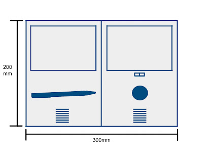
  • Dimensions: device is approximately the size of an A4 sheet of paper (A5 sheet when folded), and thin and lightweight.
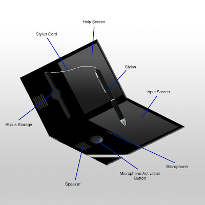
  • The device is laid out so that the user opens it like a book, as this was found to be an intuitive method that people used.
  • Two touch screens: one for input (right hand side), and one for displaying instructions (left hand side).
  • Built-in microphone and speakers for performing speech input and speech output of text.
  • Stylus has been enlarged, and is now stored in clear view in the device.
  • Stylus is attached to the device by a retractable cord, to prevent it from going missing.
  • Send information wirelessly using GPRS.
  • Can communicate with the watch using bluetooth.
  • Rechargable directly through mains.

Security System

The optional security features have been removed from the prototype, to reduce the complexity for the user, and to allow us to focus on the health monitoring aspect.

Friday 23 March 2007

Prototype Testing - Overall Evaluation and Improvements

The initial prototype performed fairly well on the whole, but there are a large number of possible improvements. The navigational method can remain relatively unchanged, with a few minor tweaks to the presentation and structure, and the devices themselves also do not need a major overhaul. The issues that must be addressed are the usability of the watch, making the stylus more robust, and adding error prevention/management.

Potential Improvements
  • Remove the security aspect, as it over-complicates the system and may not be considerate to users' current situations.
  • Change the orientation of the input device, so that it folds out like a book, which is more intuitive to the user.
  • Make the stylus larger.
  • Use a cord to attach the stylus to the input device.
  • Ensure there are error messages if input is invalid (e.g. an information category written does not exist).
  • Enable calls to a designated family member to be made using the watch.
  • Make important functions such as zooming in and verbalising text more explicit in instructions.
  • Remove tech-speak from text and buttons.
  • Allow the deletion of logged and sent information past a certain amount of time.
  • Display the sender of a message.
  • Remove the function to modify date/time and perform it automatically.
  • Provide "undo" functionality.
  • Make watch functions easier to use, but harder to perform by accident.
  • Enable sending of information to different people.
  • Ensure the watch knows if it has been taken off.
  • Add a light to the watch which can inform users about the current state (e.g. green means it's working, off means it's switched off, red means it's in alarm mode).
  • Enable replying to messages.
  • Distinguish between "return to main" and "go back" more clearly.
  • Verbalising of text needs to be made more contextual, and distinguish between text and buttons.
  • Disable "continue" button if no input provided.
  • Let the user change relevant options contextually.
  • Improve the contrast of text and background in problem areas.
  • For text relying on differences in colour, make them bold as well.
  • Add more images to buttons.
  • Make notification screens consistent across all changes to information.
  • Make the scroll bars more intuitive.
  • Order information with newest information first.

Wednesday 21 March 2007

Prototype Testing - Usability Heuristics

Based on usability heuristics defined by Nielsen and Tognazzini we performed an "expert" heuristic evaluation on the user interface for the input device. The results are as follows:

Visibility of System Status

There is room for improvement in this area for the input device, in particular making notification messages consistent across all changes and providing error messages for invalid input. There should also be feedback for incomplete information (e.g. a weight value was specified without any indication of units).

The watch is particularly weak for this heuristic, as there is no indication on the watch of its current state (e.g. is it making a call, is it actually working, etc).

Match between System and Real World

We found that the Derek persona could not understand some of the words which didn't seem too technical at first (e.g. settings, edit, main menu, etc). These need to be replaced with more suitable terms.

User Control and Freedom

Confirmation screens are used to help the user recover from a mistake, but undo could also be used after a user has saved information, to ensure they don't have to navigate menus.

Consistency and Standards

The system overall is pretty consistent, with colour coding and images used to group tasks. The use of back buttons could be made clearer, and a distinction should be made between going back a page and going all the way back to the main menu.

Error Prevention

One example we found where error prevention could be implemented is by disabling the "Continue" button if an input screen is blank, forcing the user to write something.

Recognition rather than Recall

The menus carry over important information from one screen to the next (e.g. confirmation screens contain information about what is actually being confirmed). Instructions are also available on the second screen on every page.

Flexibility and Efficiency of Use


The speech input aspect can be seen as a way to increase efficiency, particularly as our walkthroughs showed that more confident users are more willing to use it. The operation of this feature should not be made obvious to novices, so they don't get bogged down in different navigation methods.

Aesthetic and Minimalist Design

Text on screen is kept to a minimum, with more elaborate descriptions available in the contextual instructions.

Help Users Recognise, Diagnose, and Recover from Errors

As mentioned before, the initial prototype did not take into account error management for irregular input, and this should be an important part of the revised prototype.

Help and Documentation

There is a large amount of contextual help, but the initial prototype does not mention the main instruction manual. This needs to cover the operation of the watch, as well as how to perform basic multi-screen tasks using the input device.

Colour Blindness

The web application Vischeck lets you see how images appear to people with three different types of colour blindness. Some colour blindness issues were found in the interface, in particular the use of different colours to highlight important text. As an alternative, this text should also be made distinctive in another way (e.g. bolding or italics). Below is an example menu ran through Vischeck:


Fitts' Law

The interface is less vulnerable to Fitts' Law due to the use of a touch screen, so a user can access any part of the screen equally quickly.

Learnability

We found that general navigation was very easy to learn, and improvements in text language and consistency should reduce the learning curve further. The watch however had a steeper learning curve considering the small amount of interaction required.

Visible Navigation

There is limited visible navigation in the interface, with images used to remind the user of the section they are in, but they cannot view information about where exactly they are, they have to remember it.

Tuesday 20 March 2007

Prototype Testing - Voice Recognition Scenarios

For this test, we decided to see how personas would use the microphone to input commands, and compare results. We asked them to say how they would instruct the device to perform each scenario.

Maureen

Logging Weight Information -
"Add my weight... ummm.. its 12 stone seven."

Viewing Weight Information - "View my weights? This is strange..." (she forgot to let go of the microphone button).

Viewing an Unread Message - "View my messages... ummmm..." This task couldn't be pweformed in one go as the user needs to know what the unread messages are.

Modifying Date and Time -
"Change the date to the 18th of March and the time to 2:50" A problem here is that the time could be 02:50 or 14:50.

Turning on Security - "Turn my security on please." She felt a bit silly saying "please" afterwards.

Maureen eventually got the hang of the speech input, but it seemed a little odd at first, and possibly made her feel a bit embarrassed.


Fiona

Logging Weight Information -
"Insert my weight, 49 kilos."

Viewing Weight Information - "Show my weight."

Viewing messages - "Messages."

Modifying Date and Time -
"Date, 18th of March, 2 fifty."

Turning On Security -
"Security on."

Fiona was very comfortable with the speech input, and she liked the efficiency of the process. She also perceived it to be a very high-tech feature, and something she could show off. One important point to note is the use of kilos, the device must be able to handle different units.


Derek

Adding Weight Information -
"Hello? Do I speak into here? ADD MY WEIGHT... TWELVE STONES AND SIX."

Viewing Weight Information - "SHOW ME MY... I don't need to shout? Why can't I do this the other way?"

Viewing Messages - "Show me the messages. Is that okay?"

Modifying Date and Time - "18th of March, five and twenty past three."

Turning on Security - "Turn on security. Is that the last one? Thank goodness for that. Oh, I haven't let go..."

Derek found this method very odd, even more odd than using the touch screen. One thing to notice is the old-fashioned way of saying "twenty five past three".

Conclusion

The speech input mechanism was not effective for all personas, but it did achieve its goal of efficiently performing tasks in some cases. For it to be effective, the speech recognition software needs to be able to filter out junk words and be able to handle the numerous ways of saying the same thing. Another important point is that the user needs to know when they can use it, and clear notification needs to be provided if more information is required to perform a task.